


Letterforms Study Group—6th session 19 April 2023: Calligraphy and Lettering
The sixth session of the Letterforms Study Group was held at The Grolier Club, the famous New York-based bibliophile society, in their main exhibition space, on 19 April 2023. Jamie Elizabeth Cumby, the new club librarian, was our host. The attendees were Patricia Childers, Doug Clouse, Liz DeLuna, Sam Gold, Carrie Hamilton, Steve Kennedy, Claire Lukacs, Lucia McCreery, Rebecca Lehman Sprouse, Beth Tondreau, and Angela Voulangas.
The theme was calligraphy, lettering, and type. It was an ambitious theme and we failed to get through half of the requested items. We spent more time than anticipated in looking at the first few calligraphy manuals so we decided to put off the typographic material until a future session.

Letterforms Study Group session at The Grolier Club. Clockwise around the table: Liz DeLuna, Paul Shaw, Carmile Zaino, Rebecca Sprouse Lehman, Claire Lukacs, Patricia Childers, Jamie Elizabeth Cumby, and Sam Gold. Photograph by Beth Tondreau.
The first item we looked at was Nouveavx Exemplaires d’Écriture d’une beauté singuliar… (Paris, 1691), a lesser-known writing manual by Estienne de Blegny who described himself as a “M[aîtr]e. ecrivain a Paris”. The book was engraved by Claude Auguste Berey (1651–1732) and printed from copper plates. Several years later Berey wrote and engraved his own manual entitled Nouveaux Exemplaires d’Écriture de Finance & d’Italiane Bâtarde… (1694).
We followed De Blegny with two writing books by the famous Charles Snell (1667–1733) whose geometrically-inspired and simplified script provided the model for Matthew Carter’s Snell Roundhand typeface (1966). The Art of Writing, in its Theory and Practice… (London: 1712) was engraved by George Bickham (c.1684–1758), celebrated for The Universal Penman (1733–1741), his compendium of work by the best English writing masters of the day.

Page from The Art of Writing, in its Theory and Practice… by Charles Snell (London 1712). Here Snell is showing the basic forms underlying most letters. Deviations (such as ascenders) are indicated in gray.
Snell’s other book in the Grolier Club collection has the ungainly title of The standard rules of the round and round-text hands : mathematically demonstrating how better alphabets of those hands may be performed than have ever yet been publish’d in Great-Britain : absolutely necessary to be known by all writing-masters and others who would gain a perfect knowledge of those hands : and very useful for engravers, painters, masons, &c. who may have occasion to draw large inscriptions / by Charles Snell (London: Henry Overton and John Hoole, 1728). [The online copy is a later edition.]

Page from Alphabets by Robert Wilson (c.1770). The initial letter is an M. “Old Print” is textura or Old English.

Paul Shaw exclaiming over Robert Wilson’s manuscript. Jamie Elizabeth Cumby, Sam Gold, Angela Voulangas, and Lucia McCreery are looking on.
After Snell we looked at the unique Alphabets manuscript [c. 1770] by Robert Wilson. There is little known about this manuscript other than this comment by Wilson himself: “The foregoing letters are taken from an old Alphabet done with a pen in the year 1533 by one William Phillips, they being so fine and curious I attempted to copy them, but the old manuscript wanted several of the letters so that I was obliged to invent them.” Wilson’s additions fail to match the quality of Phillips’ calligraphy.
But the writing manual we turned to next was the work of a skilled writing master and lettering artist, Geometría de la Letra Romana Mayúscula y Minúscula… by D. Francisco Assensio y Mejorada (Madrid 1780). The Wikipedia page for Assensio y Mejorada (1725–1762) has a link to a fabulous calligraphic broadside (1762) by him. The letters that he constructed in the Geometria are not based on classical Imperial Roman capitals, but on Transitional typefaces. (See the double-curved leg of R.)

Construction of majuscule E and minuscule e from Geometría de la Letra Romana Mayúscula y Minúscula… by D. Francisco Assensio y Mejorada (Madrid 1780). Photograph by Sam Gold.
Oeuvres de Jean Midolle: Gravées sur Pierre et Publiées de la Lithographie d’Emile Simon fils… by Jean Midolle (Strasbourg 1835) is an astonishing book. It predictably captivated the group—even though the Grolier Club’s copy is monochrome. To learn more about Midolle and his lithographic alphabets—including their 20th century influence—check out Dan Reynolds’ essay for the Letterform Archive.
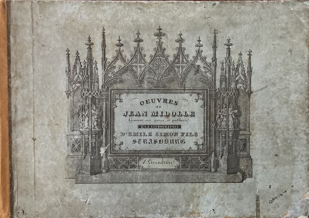
Cover of Oeuvres de Jean Midolle… (Strasbourg: Emile Simon Fils, 1836).

Title page for Spécimen des Écritures Modernes… by Jean Midolle (Strasbourg: Emile Simon Fils, 1836). The title here differs from that on the cover of the book shown above.

Detail of historiated alphabet (plate 14) from Oeuvres de Jean Midolle… (Strasbourg: Emile Simon Fils, 1836). Note the two devils.
Ramon Stirling’s magnificent Bellezas de la Caligrafía astonished the group more than the works of Assensio y Mejorada or Midolle. It is a shame that the only digitized copy is of poor quality. Everyone was oohing and aahing over Stirling’s masterful letters. His book is so large that we had to skim through it to squeeze in a few more books during our study session.

Page from Bellezas de la Caligrafía by Ramon Stirling (Barcelona 1844).
When we got to the 20th century we encountered a book that was very different from the previous ones. Instead of a writing master’s manual, we had a textbook dedicated to sign lettering. L’Enseigne Commerciale: Méthode de Lettres Classiques. Premiére Partie. Étude de la Forme by the firm of Revolon (Lyon n.d.) delighted everyone by its use of color. The letterforms vary in quality, but the instructions and diagrams on how to make shadowed letters or letters in perspective are both visually exciting and conceptually fascinating.

Planche XI (Lettres a Boules ou a Crochets) from L’Enseigne Commerciale (n.d.).

Planche XIX (Théories des Épaisseurs et des Ombres) from L’Enseigne Commerciale (n.d.).

Carmile Zaino, Paul Shaw, Sam Gold, and Patricia Childers examining two plates from L’Enseigne Commerciale (n.d.)
We wrapped up the study session by looking at something that was very different, a portfolio of six plates titled Principles of Freedom designed by Hermann Zapf for the Scott Paper Company (Philadelphia 1964). Two of the plates are calligraphic while the others are typographic, using the typefaces of both Zapf and his wife Gudrun Zapf von Hesse. The calligraphy is a contemporary interpretation of chancery italic.
 TO TOP

